TOP 5 COMMON WEBSITE LAUNCH MISTAKES TO AVOID
You’re finally launching your website…but are you missing something?
So you’ve got the idea. Maybe even a logo. A design in your head. You’re all set to go live.
But wait.
Before you hit that “publish” button, pause for a second.
Because the truth is, launching a website isn’t just about making it look pretty or getting it out there fast. It’s about building something that actually works, brings in traffic, and converts visitors into customers. And guess what? Most people mess that up.
They launch too soon. Skip the basics. Overthink the wrong things. And before they know it, the website they poured energy into… just sits there. Quiet. No traffic. No sales. No results.
This blog is your shortcut to avoiding that.
I’ll walk you through the top 5 common website launch mistakes people make (even smart ones), and exactly how you can avoid them.

Mistake 1: Not defining a clear purpose for your website
This is the root of most website failures and the one of the common website launch mistakes a developer makes. And, trust me, you have to avoid this.
If you’re launching a site with the vague idea of “just having an online presence,” pause.
Ask yourself: Why does your website exist?
- Do you want to collect leads?
- Are you trying to sell a product or service?
- Do you want people to read your content or build trust in your expertise?
If your website has no clear purpose, it becomes digital clutter. Visitors won’t know what to do. You won’t know what to track. And the whole thing becomes a confusing experience.
How to Fix It?
- Write down your website’s primary goal in one sentence. Example: “My site’s job is to get leads for my freelance design business.”
- Make that goal obvious on the homepage. Ask a friend to open the site for 5 seconds and tell you what it’s about. If they can’t guess the goal, fix it.
- Design every section with that goal in mind.
- If it leads: prominent form or booking button.
- If it’s sales: clean product display + Buy Now.
- If it’s brand awareness: great visuals + credibility + contact.
Don’t launch until your site has one clear job, and it does that job well.
Mistake 2: Ignoring Mobile Optimization
More than 50% of web traffic today comes from smartphones. If your site looks broken, loads slowly, or acts weird on a phone, people bounce. And once they leave, they’re not coming back.
Mobile-friendliness isn’t optional. It’s basic survival. And, specially in this era this website launch mistake is super common and you JUST cannot afford to ignore it.
How to Fix It?
- Use Responsive Design: This means your layout adapts to all screen sizes automatically. Most modern CMS tools (like WordPress, Webflow, or Shopify) support this — but you have to test.
- Test on real devices, not just your desktop browser: Open your site on different phones: iPhone, Android, tablet. See what breaks.
- Avoid these mobile-killers:
- Pop Ups that cover the screen
- Tiny buttons or unreadable text
- Slow loading pages due to heavy images
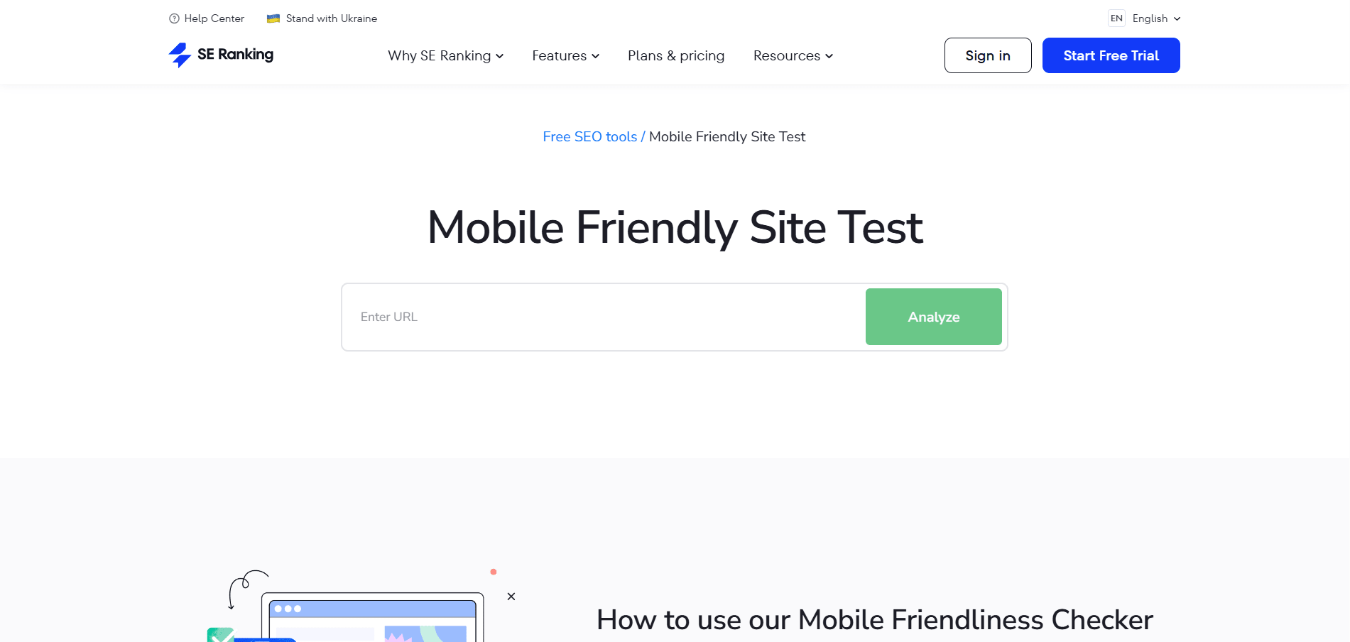
- Run it through Mobile-Friendly Test: This tells you exactly what’s wrong — and how to fix it.
Mistake 3: Skipping SEO (Search Engine Optimization)
Okay yes know that you’ve built a solid website. Looks good, loads fast. But nobody’s visiting it. Why?
Because you’ve made one of the biggest yet common website launch mistakes.
That’s what happens when you skip SEO (Search Engine Optimization), your site is live, but Google has no clue what it’s about. And if Google doesn’t get it, your potential customers won’t either.
This is not about ranking 1 for some impossible keywords. It’s about making sure your site is findable when people are already looking for something you offer.
How to fix it?
1: Know what people are searching for
Start with keyword research. You’re not guessing here — you’re finding out the exact words people type into Google when they’re trying to find what you sell or do.
Use free tools like:
- Google Keyword Planner
- Ubersuggest
- AnswerThePublic
Look for:
- Real questions (like “how to launch a new business website”)
- Phrases your audience would naturally say
- Keywords with decent traffic but low competition
This helps you target what real people actually want, not just what sounds good.
2: Use your keywords smartly
Now that you have your keywords, don’t just stuff them everywhere. Use them where it actually matters:
- In your page titles
- In your headings (H1, H2, etc.)
- Naturally in your content
- In your URLs
- Inside your image alt text
3: Don’t forget the technical stuff
- Use clean, short URLs: example.com/seo-tips not example.com/page?id=123
- Write compelling meta titles (under 60 characters)
- Write meta descriptions (under 160 characters) that make people click
- Use heading tags properly (H1 for main title, H2 for sections)
- Create a sitemap and submit it through Google Search Console (It tells you how Google sees your site and what keywords people are using to find you (or not find you yet).
- Make sure your site is HTTPS secure, mobile-friendly, and fast
Mistake 4: No Clear Call to Action (CTA)
If your website doesn’t clearly tell them what to do next, chances are, they’ll do nothing. Not because they’re not interested, but because there’s no direction.
No CTA = no conversion. Simple.
It doesn’t matter how good your design or content is if your visitor is left wondering, “What now?”, you’ve already lost them.
Most websites make this mistake by either hiding the CTA, placing five different ones on the same page, or making it so dull that nobody wants to click it.
How to fix it?
1. Decide on One Clear Action
Before anything else, get brutally clear about what you want your visitor to do. Do you want them to:
- Call you?
- Fill out a contact form?
- Buy a product?
- Book a service?
- Download a brochure or PDF?
Pick one. Because if you’re asking them to do all five, they’ll do none. Your page should have a single focus — and that starts with a single CTA.
2. Place the CTA Where It Actually Gets Seen
Too many websites hide their main CTA in the footer or tuck it away in a corner. Bad move.
You need to place your CTA in spots where users naturally pause or take decisions:
- At the very top (header or hero section)
- After major sections of content
- Right before a user would bounce (bottom of the page)
The idea is: no matter where someone is on your site, they should know exactly what to do next.
3. Make It Visually Stand Out
If your CTA button looks like every other part of the site: same font, same color, same size, it’s going to get ignored.
Instead, use:
- A contrast color for buttons (one that pops from the background).
- Short, punchy, action-oriented text like “Book My Free Demo,” “Get Quote,” or “Download Now”.
- Enough spacing around the CTA so it doesn’t feel crammed or hidden.
Also, ditch the word “Submit.” It’s vague, robotic, and doesn’t tell anyone what they’re actually doing.
4. One Page, One CTA
This is where most websites go wrong. They stack buttons like “Buy Now,” “Subscribe,” “Read Blog,” “Join Webinar” — all on the same page. And guess what happens? The visitor does none of it.
Every page on your site should have one goal, one message, one action. You’ll get better results by guiding them clearly than by overwhelming them with choices.
Mistake 5: Launching Without Testing
You wouldn’t launch an app without testing, right?
So why publish your website without running it through a solid check?
Here’s the thing: many business owners spend weeks building their site, picking colors, writing copy, designing layouts but forget the final (and most important) step before going live.
Testing.
And not just glancing over it. We’re talking real, focused pre-launch testing, the kind that saves your reputation before a customer finds what you missed.
Because what seems “fine” to you might be full of silent problems like broken links, buttons that don’t work, or forms that never reach your inbox.
What Can Go Wrong?
You might think everything looks good on your screen… but here’s what often gets ignored:
- Links that go nowhere — or worse, to the wrong place
- Buttons that don’t trigger anything
- Forgotten “Lorem Ipsum” or obvious typos
- Contact forms that look great… but don’t actually send emails
- Pages that take forever to load
- Images that break on mobile
- Pages that never show up on Google because they weren’t indexed
- Missing SSL certificates that scare visitors with “Not Secure” warnings
Even one of these issues can seriously hurt your brand’s first impression.
How to Fix It?
Before you launch, run a Pre-Launch QA Checklist — not just to tick boxes, but to genuinely experience your site like a first-time visitor would.
Here’s what to check:
- Test Every Link and Button :Click on everything, literally. Internal links, external links, menu items, buttons, footer navigation. They should all take the user exactly where they’re supposed to go.
- Check All Forms: Submit every form on your site. Make sure the data actually arrives in your inbox, and test for mobile usability. A non-working form = lost leads.
- Load Speed Matters: Use tools like Google PageSpeed Insights or GTmetrix. If your site takes longer than 3 seconds to load, that’s a problem — especially on mobile. Compress images, eliminate unnecessary scripts, and optimize your server.
- Mobile and Cross-Browser Testing: Just because your site looks perfect on Chrome doesn’t mean it’ll behave the same on Safari, Firefox, or mobile browsers. Test it across multiple devices and screen sizes.
- Look for Placeholder Content: Leftover “Lorem Ipsum,” broken images, or unfinished sections instantly damage trust. Triple-check every page for anything that feels incomplete.
- Fix 404 Errors: Set up proper redirects for old or broken links. A single “Page Not Found” error can kill trust fast. Use a custom 404 page if needed — but better yet, avoid them entirely.
- Secure It with SSL: Make sure your site has an active SSL certificate (HTTPS). A “Not Secure” warning in the browser is the fastest way to scare visitors off — especially if you collect any data.
- Get Real Feedback: Before launch, ask 3–5 people (who weren’t involved in the build) to navigate your site. Watch where they get stuck, confused, or click the wrong thing. If they’re lost, your users will be too.
Build It Right, The First Time
Launching a website isn’t just about going live. It’s about getting it right before anyone sees it.
Every mistake we’ve discussed isn’t just a technical issue. It’s something that affects how people see your brand, how they interact with your business, and ultimately, whether or not they trust you.
But the good news? Every one of these mistakes is 100% avoidable, especially if you have the right partner guiding you through the process.
At Raindrops Infotech, we don’t just build websites. We build launch-ready, future-proof online experiences that tick every box.
Whether you’re planning your first website or relaunching an old one, we’re here to make sure nothing gets missed.
Thinking of launching your website the right way? Schedule a free consultation with us!


